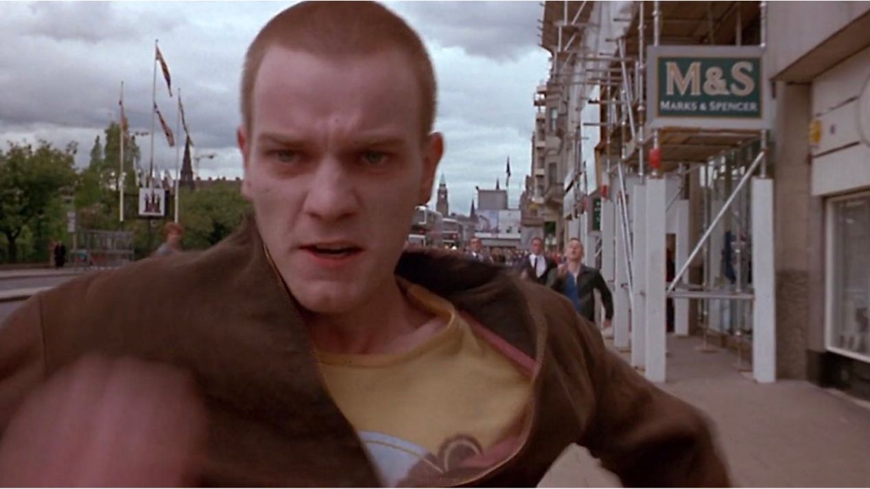
“You can’t look at a photo of Renton and Spud running down the Princes Street in Edinburgh being chased by security guards without Iggy Pop singing ‘Lust for Life’ popping into your head. I guess it’s as important that the design should try to stir up similar memories.”
Mark Blamire
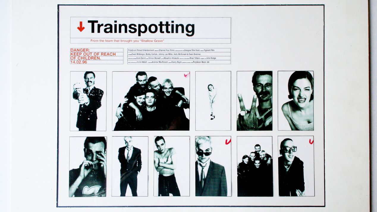
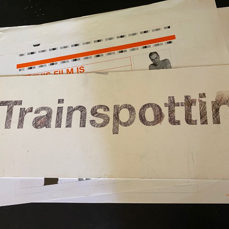
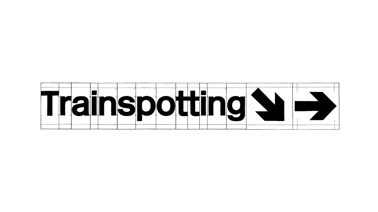
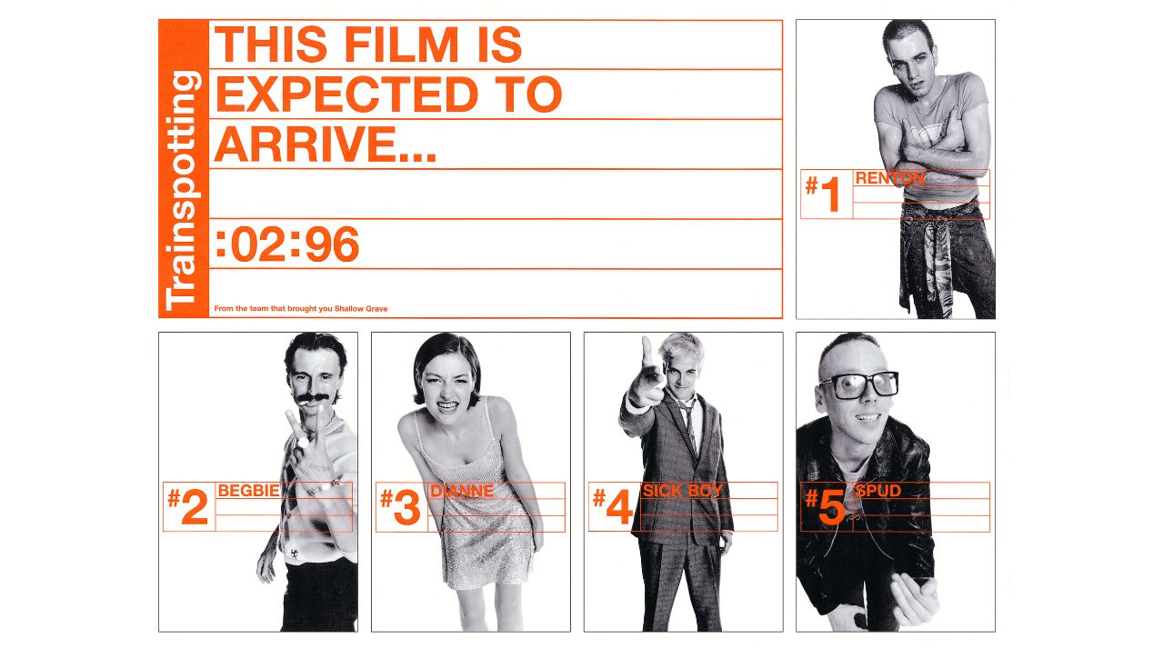
Using bright orange and Helvetica typography to recreate the warning signs from prescription drugs, black and white photography by Lorenzo Agius, and motifs from the British Railway system and road signs, Mark Blamire created what has become one of the most iconic and instantly recognisable film posters of all time.
Trainspotting defined a generation of film-making, with Mark and his team adding to the legacy. We caught up with him to discuss his music background, his enduring design, and how film marketing has changed over the last 25 years.
Can you take me through what you remember from the original brief for the poster and identity? According to Lorenzo Agius it was a little vague!
We were given production stills from a film called ‘Backbeat’ about the early days of The Beatles in Hamburg. It wasn’t much to go on really and the reference did seem like a misdirection. We only really had Irvine [Welsh]’s book and the film script to give us ideas to develop and a couple of reference photos to the cast.
The film was in post-production when you guys were creating the work. How did that affect the way you worked? Did it hinder the progress, or was it freeing?
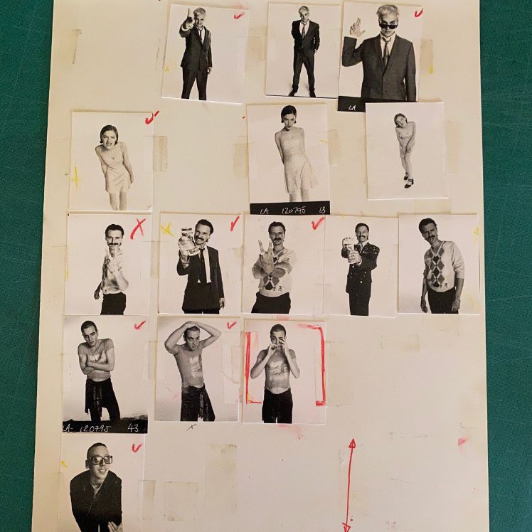
Having plenty of time to work on a campaign and its branding is beneficial; it allowed us to plan what we wanted to do with the actors and meant we could organise and art direct the photoshoot and influence how the photography would look. Normally on a film poster campaign, the designer will be given a bunch of production photos that are taken on set and the designer has to try and salvage what the poster art will look like. So it is frustrating and it can be a turd-polishing exercise. Having time to plan and work out how the finished design would look in advance, and access to the actors for a planned photoshoot, was a massive positive, helping to make something more considered and planned.
What was the landscape of design like in film marketing at the time?
I love all the classic posters of the 60’s, with designers like Saul Bass working for Alfred Hitchcock. It was a real golden era of intelligent thought-provoking art and design, even through to his later work for Kubrick. The printing and simple use of colour palette were an absolute joy to look at, but by the 90’s it was a tired format following the lines and mostly generic rubbish, repeatedly copying and stealing a successful style until it became a tired parody of itself. I thought the film poster for ‘Shallow Grave’ sucked; it was an awful poster for a great film. I think by the 90’s, the film poster had mostly become a marketing tool using tired clichés rather than simple clean design solutions created to catch peoples’ eyes in a new or refreshing way. There were some notable stand-out exceptions like ‘Reservoir Dogs’ or ‘The Usual Suspects’. It was really sad that film marketing was in such a tired rut, as the visual design scene for the music industry and in club culture was so strong, bold and exciting, by comparison, at the time.
I read you were given lots of time to develop and nurture the ideas, why do you feel the film company gave such consideration to the design side of things?
I just think the film company believed that it was an amazing book by Irvine Welsh, and that Danny Boyle would deliver another amazing film. I think they wanted to get the design and branding bang on and if you want to do a good job then this takes time to plan and deliver.
A difficult one perhaps, but 25 years on, what’s the secret to creating work that doesn’t go out of date?
It’s simple, as I understand the formula I used for ‘Trainspotting’ and why it worked – keep it minimal, less is more. So for me, in 1995, it was about channelling the spirit of Modernism into the design: study the masters like Josef Müljer-Brockmann, Wim Crowel, Otl Aicher, Saul Bass to try to understand how they mastered making timeless design classics, i.e. work that never goes out of fashion. Then get PolyGram Films to spend 3.5 million pound marketing and promoting the film poster so everyone sees it, that helps a huge amount too. Also try not to create something fashionable and of its time, that always goes out of date very quickly.
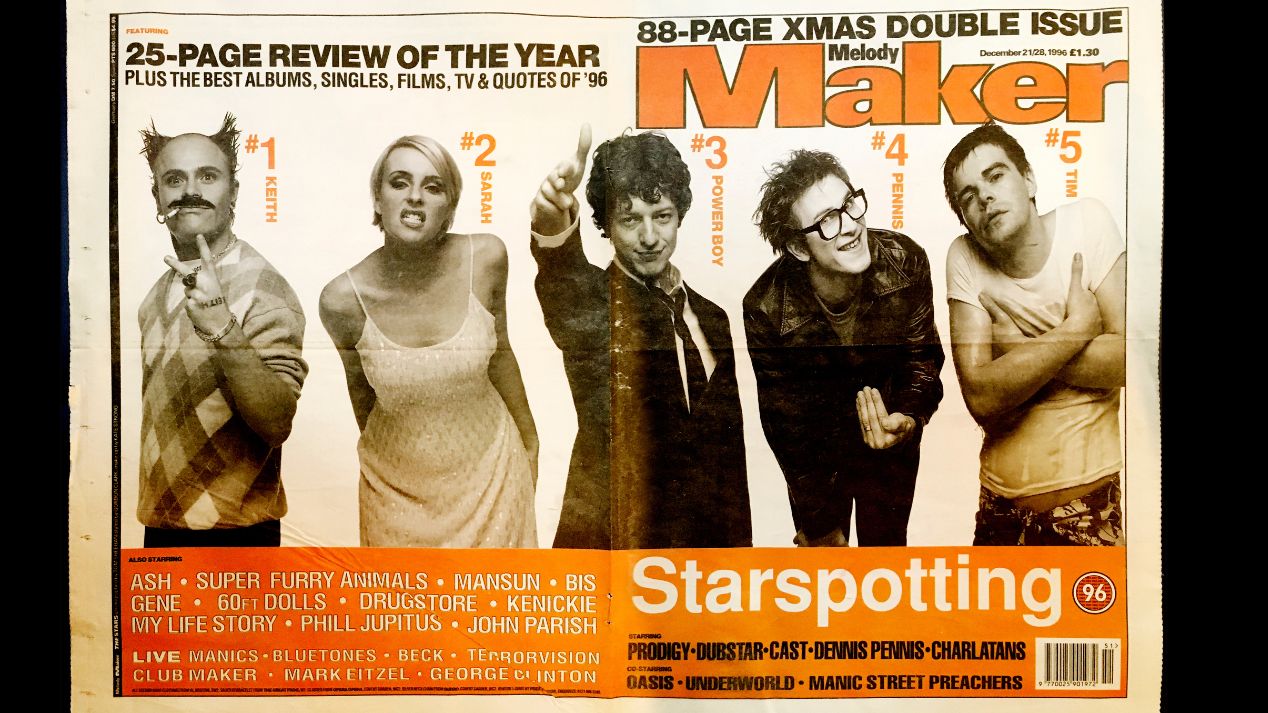
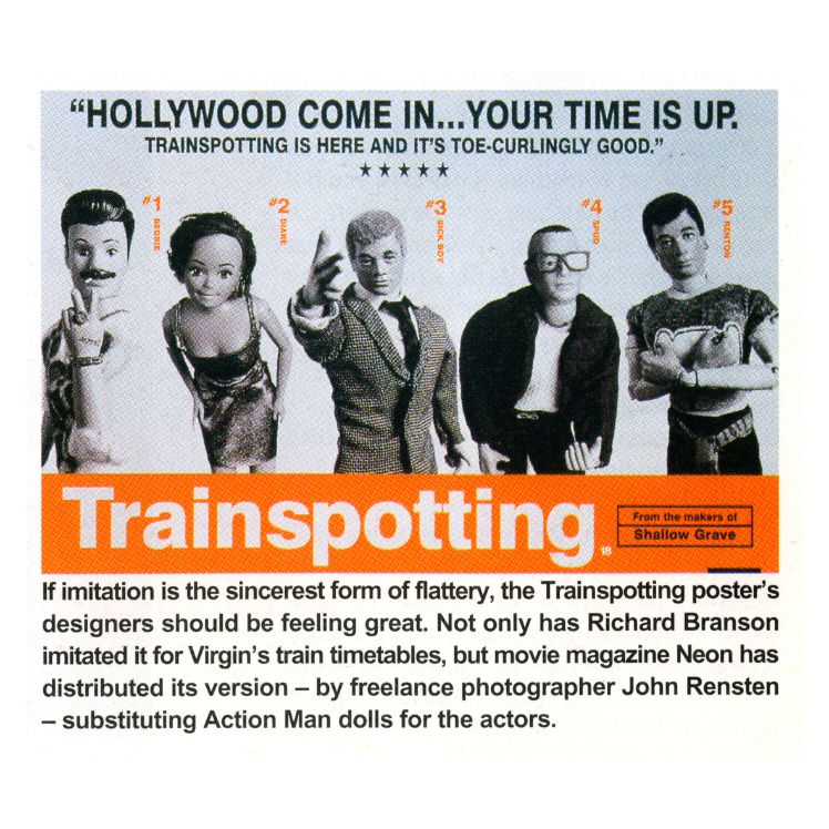
I read a quote from Rob O’Connor saying he collected all the pastiches of the poster that he saw. Do you still see the influence of the ‘Trainspotting’ work 25 years on?
I am not sure I can take credit for influencing design 25 years on when I heavily borrowed the visual style of 1960’s Modernism, but I will take it, if that’s what you think…
But yeah, weirdly today, on the subject of pastiches, I saw some branding for Fred Perry on social media and I thought, ‘Ooh cheeky!’, but it’s flattering that people still think it’s worth parodying. It could have also just been a coincidence that it was just Helvetica in boxes as they hadn’t used orange… But yeah, I still see the occasional copy and it always makes me smile.
Finally, looking at how design has evolved since 1996, how do you feel your ‘Trainspotting’ work will be received in another 25 years?
Ooh that’s a good question, I don’t know really, I hope it will still stand up. I always think the simpler solutions take longer to achieve and perfect. People who don’t understand the process or realise the craft involved can think it was done in five minutes, whereas we spent a good two to three months of development, thinking and planning to get to that direction and stage of simplicity. It’s hard to second guess trends and technologies in the future of where we might end up or what people think. I strongly believe and hope that modernism and simplicity will always be timeless. I hope it will still stand up, although I guess there will be fewer parodies as the next generation might not recognise the visual pun, who knows?